bigDAWGS brand revamp

Task

bigDAWGS is a print and tech company of 16 people, and its orange failed contrast with the brand’s off white text. I directed a refinement around the logo: a deeper orange, the type system, and the rules the website runs on. The CEO approved it, the new colour went into use, and the team moved straight into the website redesign.
  • Strategy

    Brand direction, audience research

  • Design

    Logo refinement, colour, type, brand book

  • Role

    Head of Design, bigDAWGS

BRAND · BIGDAWGS · 2025 TO 2026

The brand, refined for the buyers it wanted

bigDAWGS sells NFC, video and print products to businesses, but its orange failed contrast with the brand’s off white text: 2.38:1, below even the 3:1 minimum for large text. I directed the refinement around the logo: a deeper orange, the type system, and the rules the website runs on. The CEO kept the logo itself, the new colour went into use, and the team moved straight into the website redesign.
bigDAWGS brand book cover
01. The logo

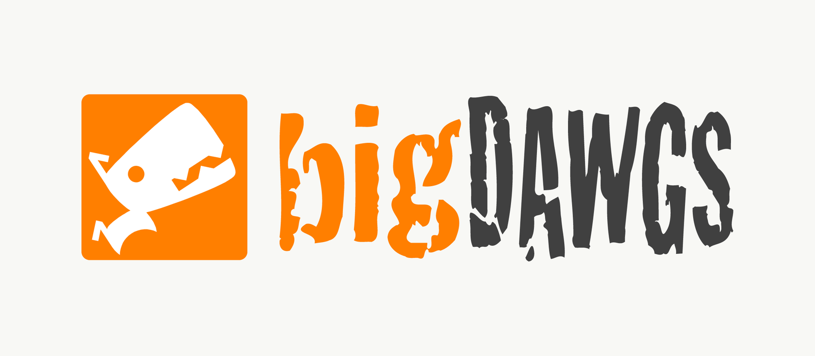
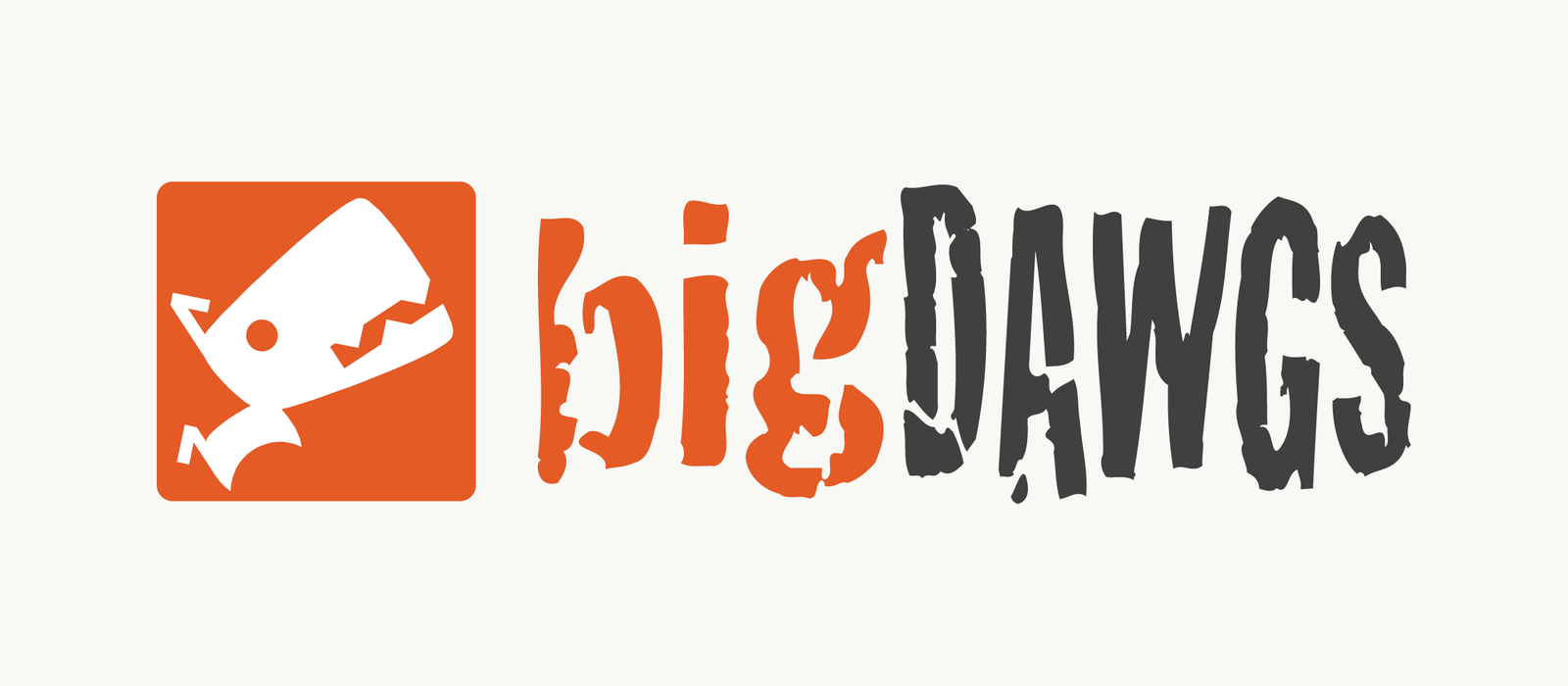
Same logo, a better orange

The CEO kept the logo for recognition, so the one change was its colour. #FF7F00 became #E45B26, which lifts the off white text from 2.38:1 to 3.39:1 and clears the 3:1 minimum for large text and logos. The book fixes the proportions: the icon is the unit, with a set gap and clear space around it.

SLIDE TO COMPARE

Before After
02. Direction

Built for the people who buy

The research board named the buyer: marketing agencies, corporate departments and other agencies. Its rule for them was functionality over heavy design, so every choice after it had to earn its place.

Audience

Marketing agencies, corporate departments and other agencies.

Tone

Focused, bold, professional and solution oriented.

My role

I directed the revamp and worked on the brand system myself: logo, colour, type and the rules in the book.

Status

Approved by the CEO. The new colour went into use, and the website redesign came next.

03. Colour

An orange that passes, and a call made knowingly

#FF7F00 became #E45B26. The old orange failed even the large text rule with off white text. The new one passes it at headline and button sizes. The colour is the part that shipped.

A · The numbers

Off white text on each orange

Old orange
#FF7F00
2.38:1Fails, even for large text
New orange
#E45B26
3.39:1Passes for large text
Amber
#9E3F1B
6.21:1Passes for body text

WCAG AA asks 4.5:1 for body text and 3:1 for large text.

B · The call

Black passed. We kept white.

What happened

Black on the new orange scores 5.82:1 and passes for body text. It also made the dog logo look menacing. With the numbers in front of him, the CEO kept white, used only on logos, headlines and buttons.

Why it matters

The brand is part of the product. The call was made on purpose, not by accident.

C · The fallback

A darker amber for small text

What I chose

#9E3F1B clears AA with white text. The system uses it as the hover state, so the accessible version is already there.

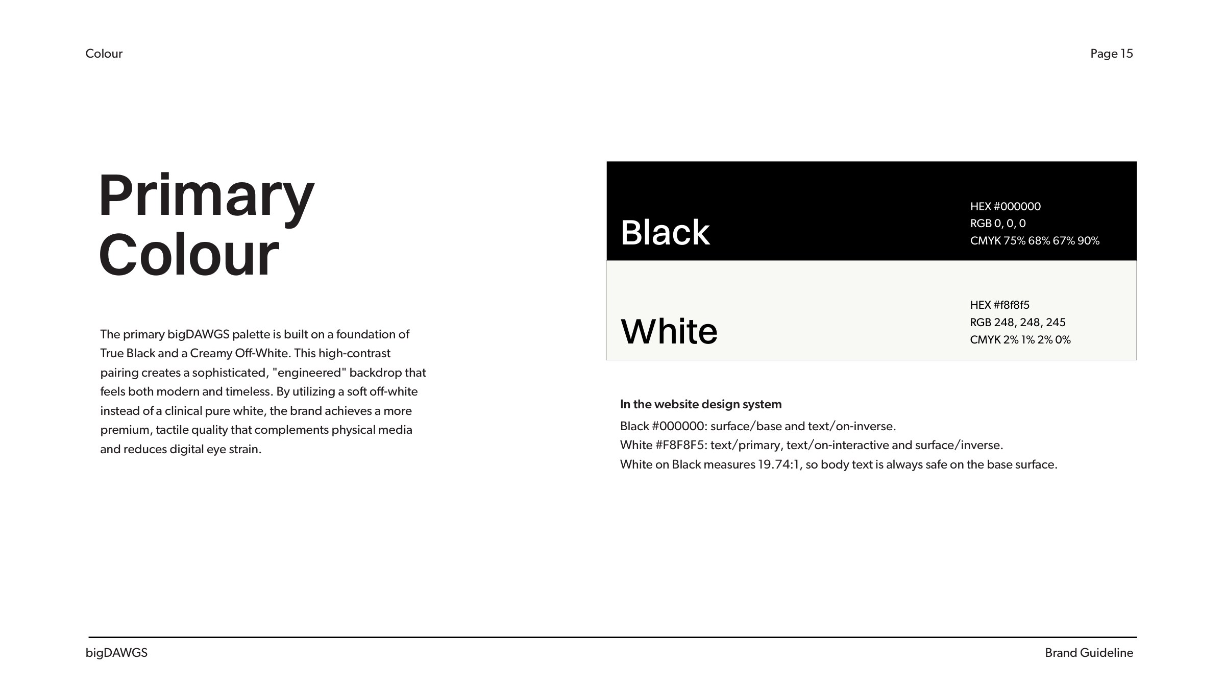
bigDAWGS brand book page 15: primary colours and their website tokens
Primary colours, and the website tokens they feed
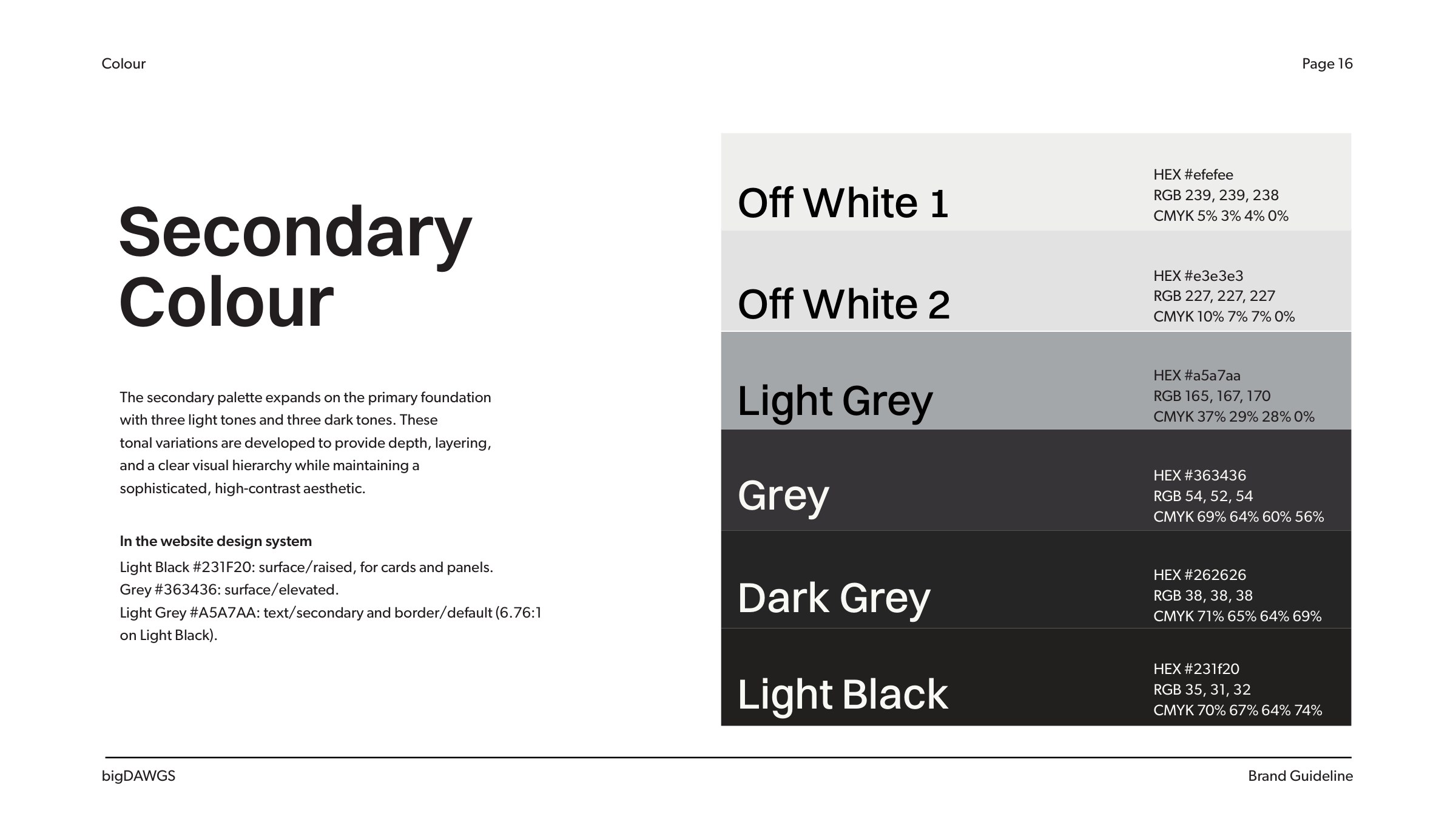
bigDAWGS brand book page 16: secondary colours and their website tokens
Secondary colours: the greys behind the website’s surfaces
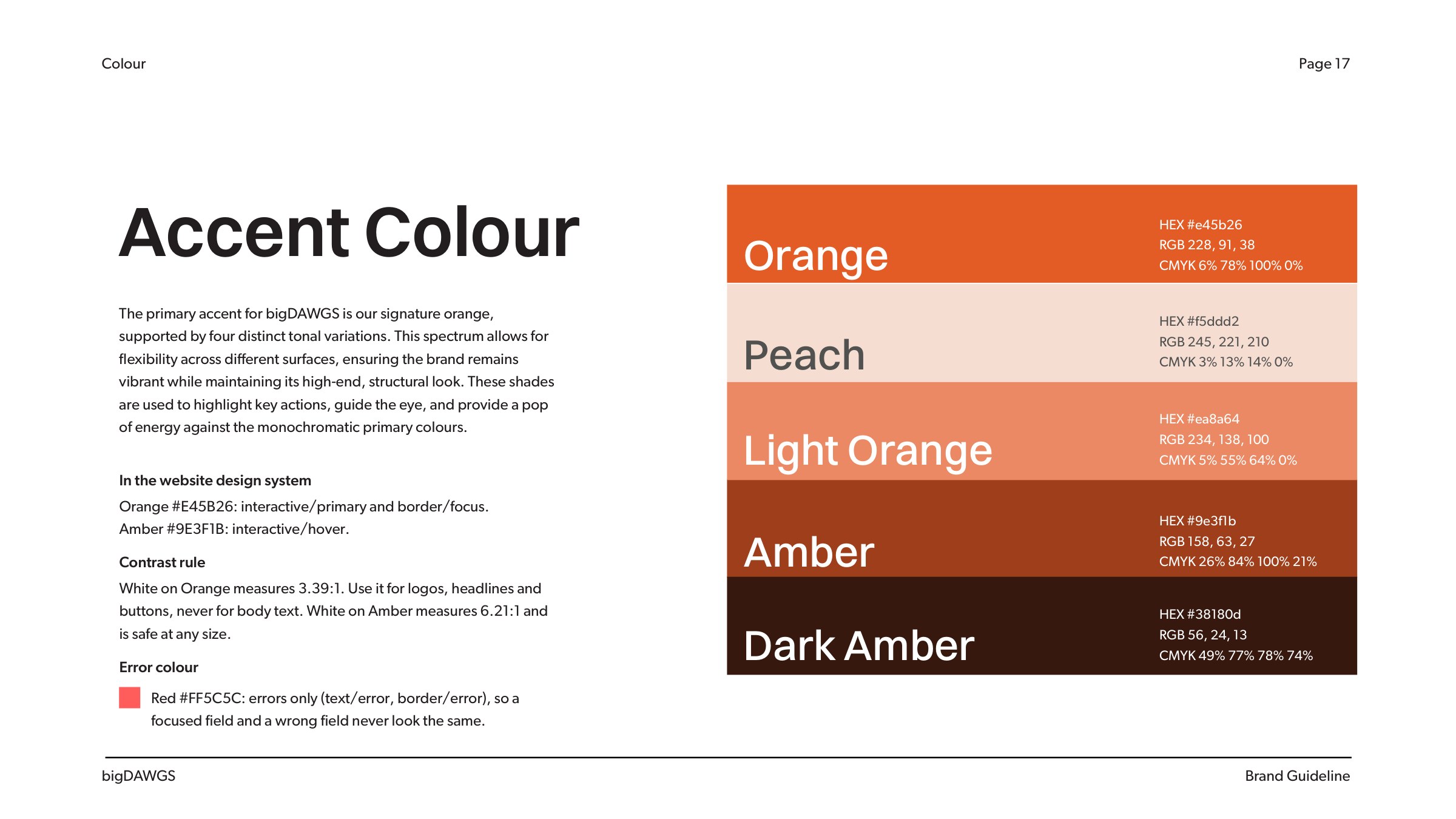
bigDAWGS brand book page 17: accent colours, contrast rule and error colour
The accent scale, the contrast rule and the error colour
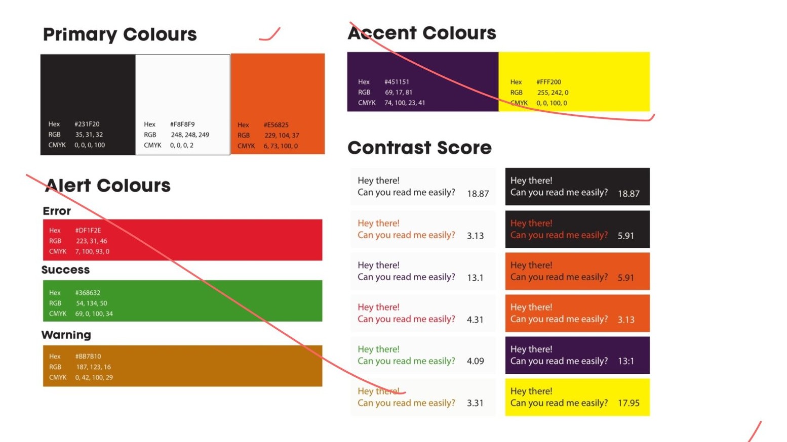
Colour trials on a Miro board, with the rejected options struck out
Colour trials on the board, rejects struck out in red
04. Type

Switzer for headlines, Gibson for body

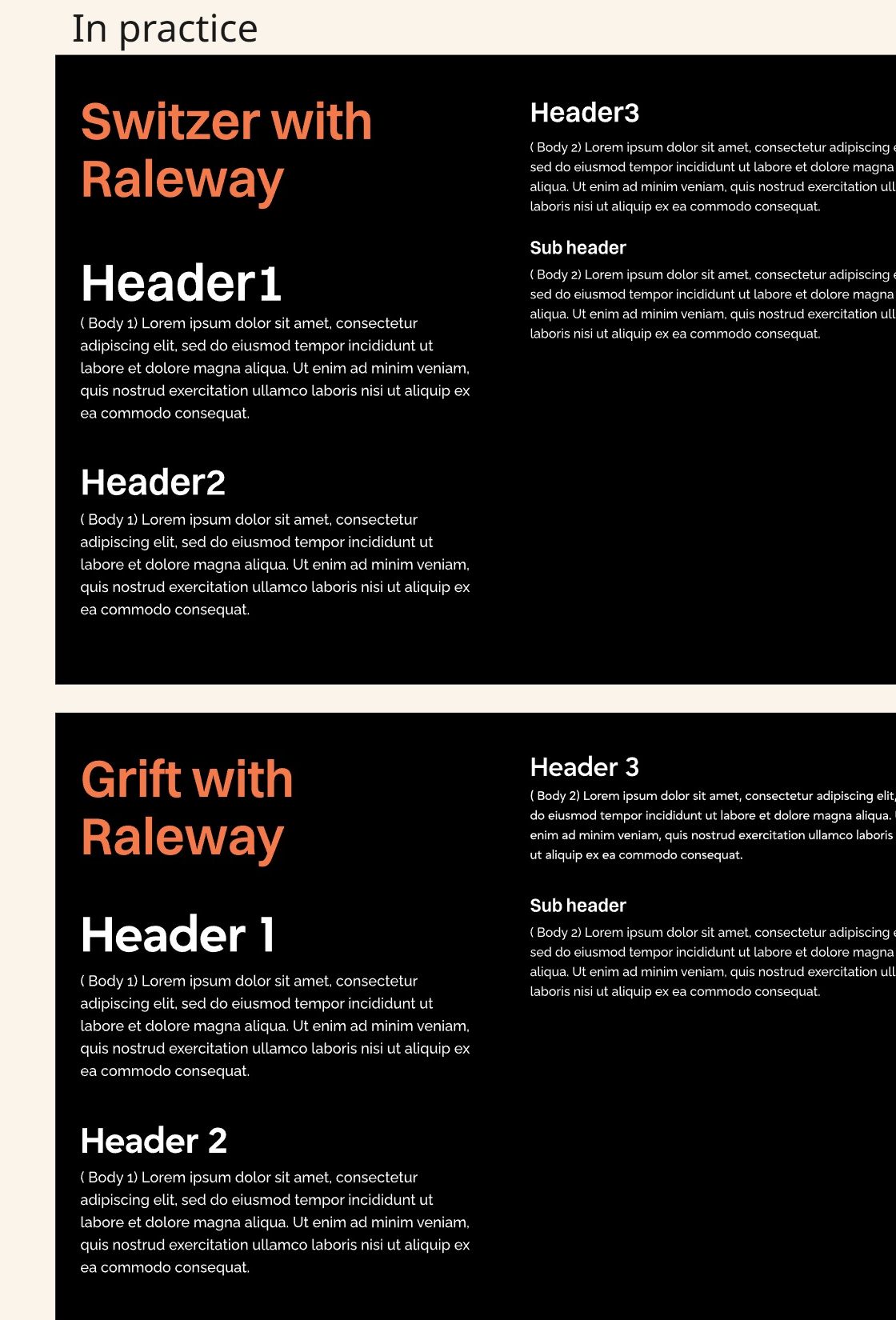
I set Switzer against Grift at the same sizes and weights, in real headers, and chose Switzer for three reasons. Grift is a geometric sans, built from circles and straight lines, and that construction reads friendly and consumer. bigDAWGS was selling to agencies and corporate teams who want function over decoration, so the headlines needed the plainer, engineered voice of a neo grotesk. A quiet headline face also leaves the grunge wordmark as the one loud element, where a face with that much character would compete with it. And Switzer’s large x-height keeps button labels and product specs clear at small sizes on the website the system was built for. Gibson sets the body, and the grunge type stays inside the logo.

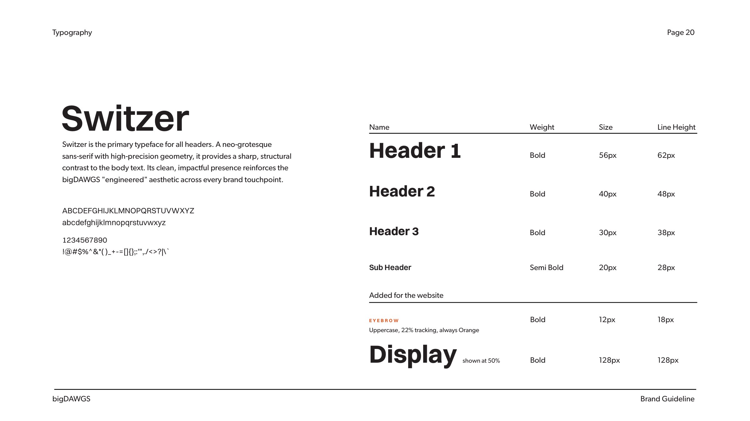
The type scale

Header 1Switzer Bold, 56 px

Header 2Switzer Bold, 40 px

Header 3Switzer Bold, 30 px

Sub headerSwitzer Semi Bold, 20 px

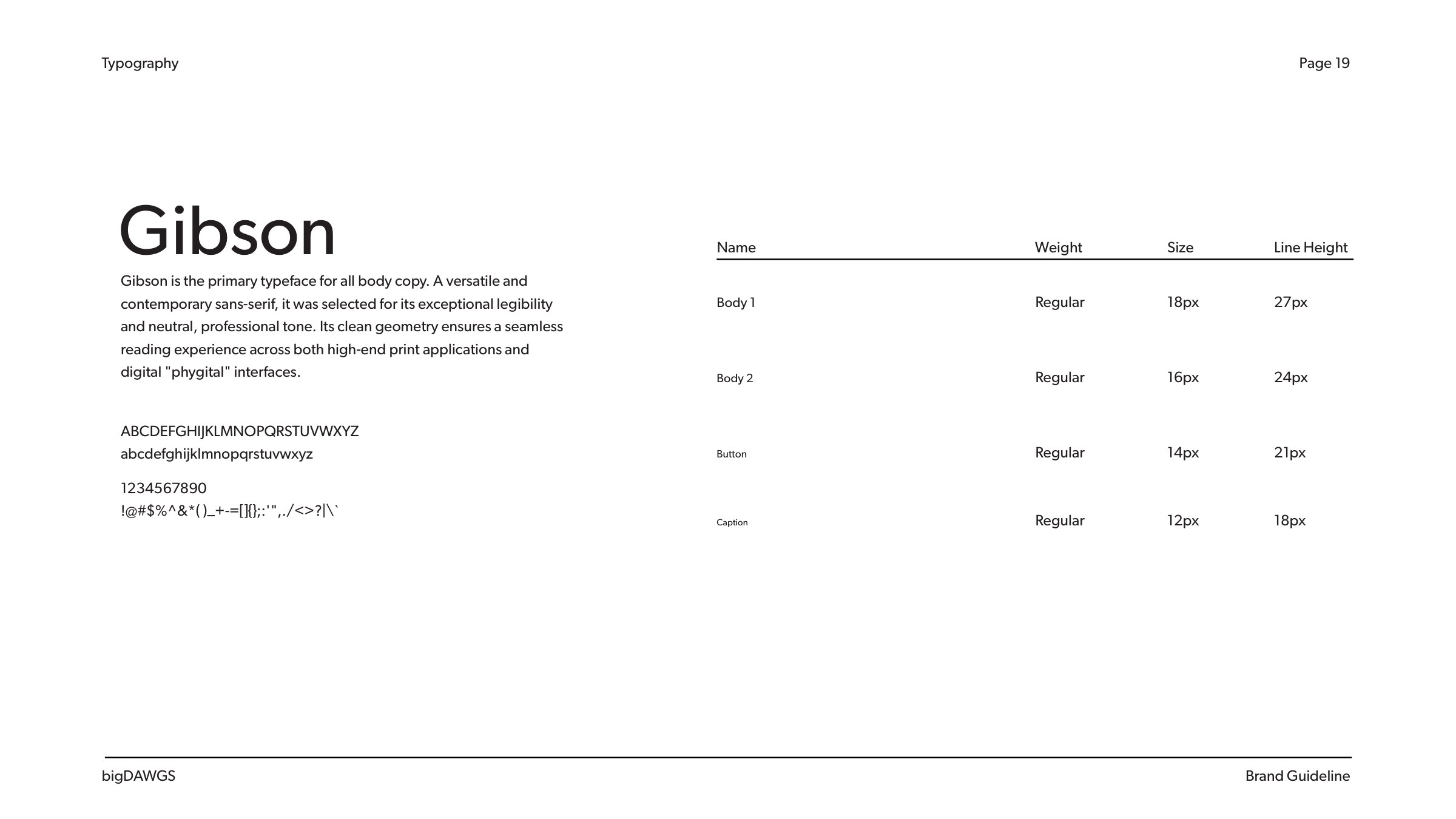
BodyGibson

Headline rule: leading x1.1, up to three words a row.

Switzer and Grift set at the same sizes and weights, compared on a Miro board
Same sizes, same weights: Switzer on top, Grift below. Gibson later replaced the Raleway body text.
bigDAWGS brand book page 20: Switzer header scale with Eyebrow and Display
Switzer header scale, plus the Eyebrow and Display styles the website added
bigDAWGS brand book page 19: Gibson body type scale
Gibson body scale: 18, 16, 14 and 12 px
05. The brand book

Rules other people can use

The book turns each decision into a rule the team can follow without me. Three of its pages.

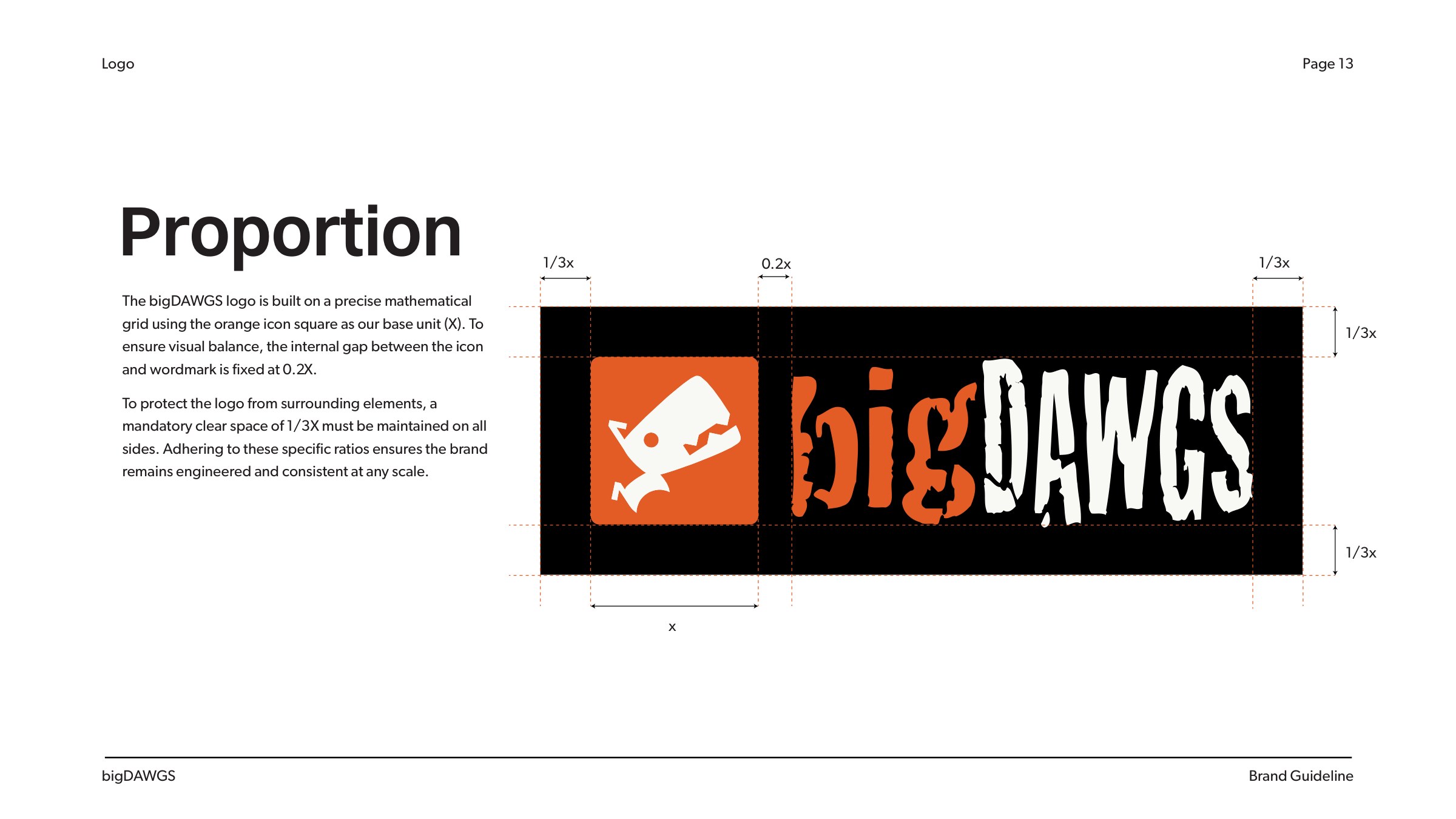
bigDAWGS brand book page 13: logo proportion
Brand book, proportion

PROPORTION

The icon is the unit. The gap is a fifth of it and the clear space a third, so the logo holds together at any size.

bigDAWGS brand book page 12: unacceptable logo use
Brand book, misuse

MISUSE

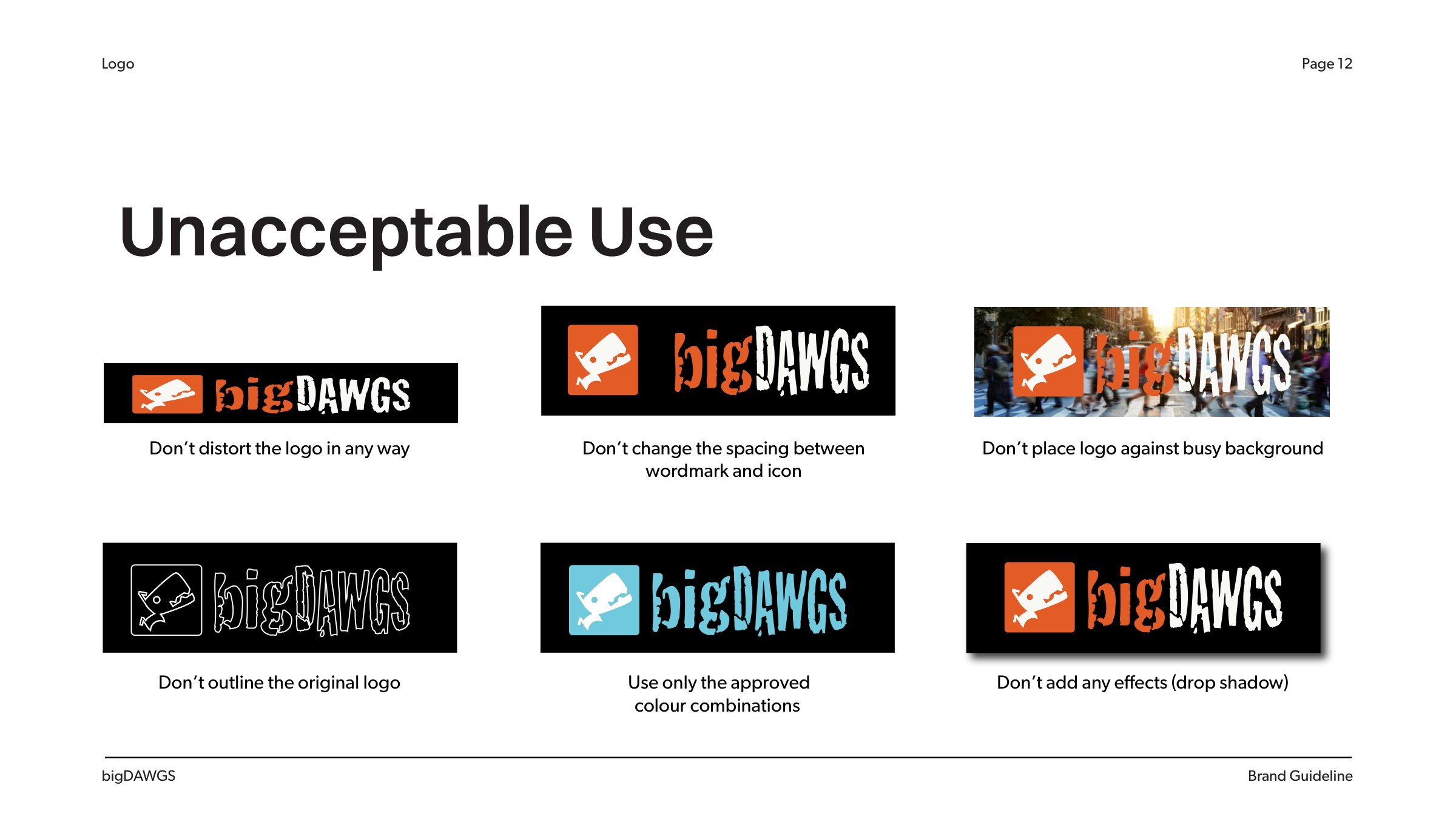
Six ways not to use it. No stretching, no outlines, no busy backgrounds, no effects, no respacing and no off colours.

bigDAWGS brand book page 11: logo colour options
Brand book, colour options

COLOUR OPTIONS

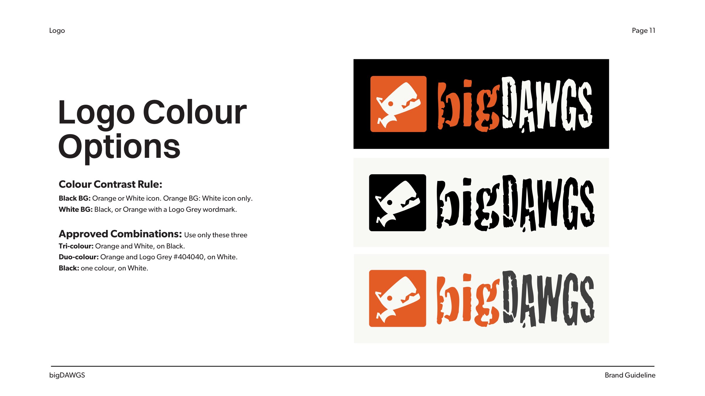
Three approved versions. Orange and white on black; all black on white; and orange with a dark grey “DAWGS” on white.

06. From brand to web

The book became the website’s tokens

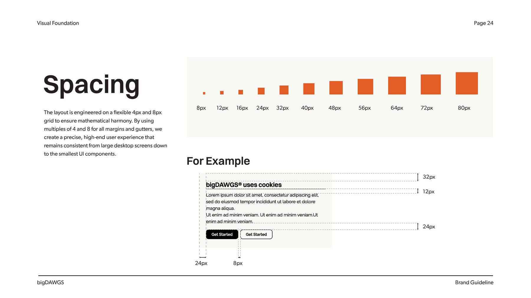
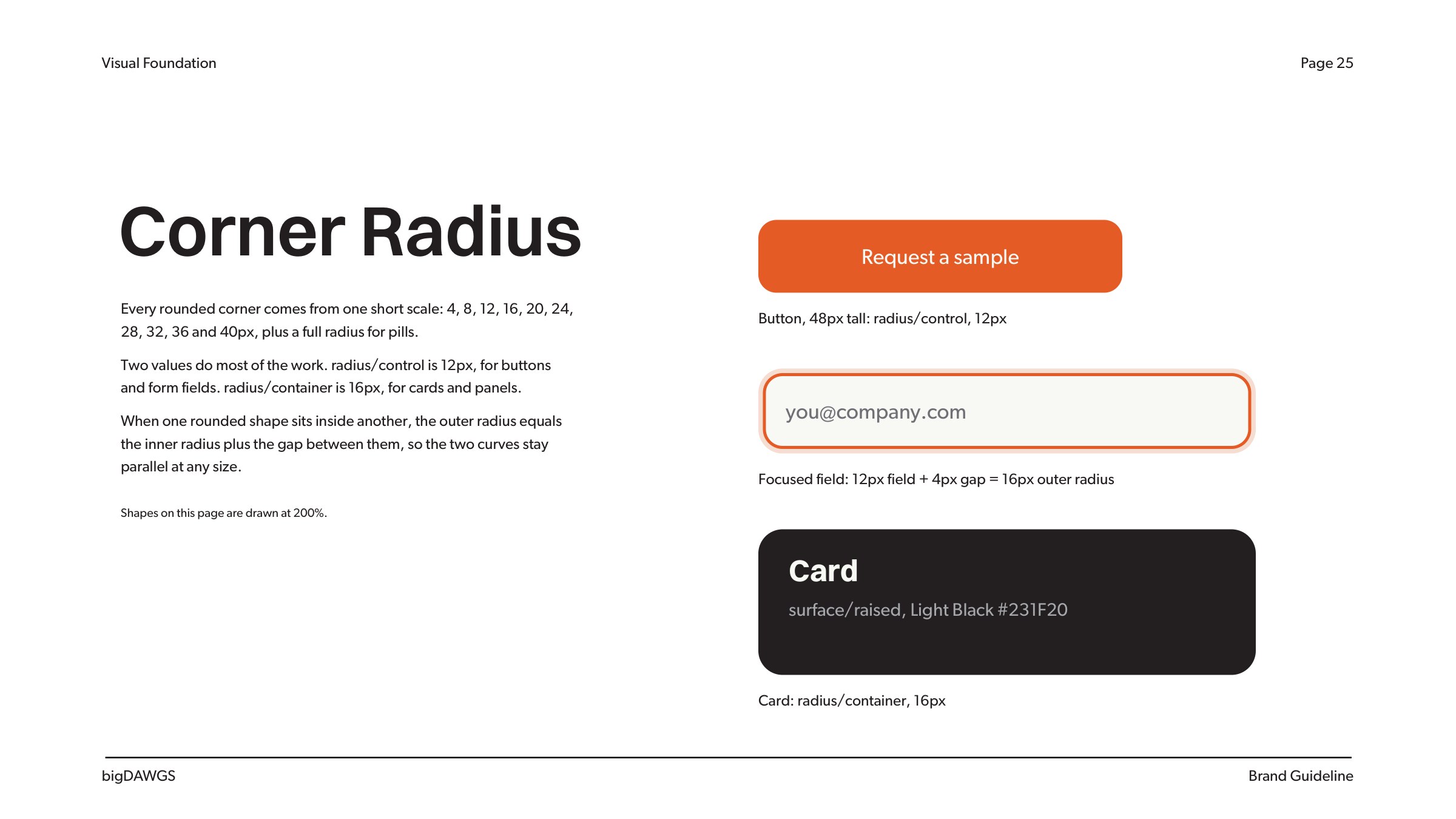
The spacing and radius rules in the book are the tokens the website redesign runs on. The redesign case study shows them working across sixteen screens.

A · Spacing

A scale from 8 to 80

Multiples of 4 and 8 for every margin, gutter and gap.

B · Radius

Fixed, not scaled

12 for controls and 16 for containers, so one button reads as one component at every size.

C · Colour

One variable

The brand orange is one token. Every button, chip and link reads from it.

Brand book page showing the spacing scale
Spacing in the brand book
bigDAWGS brand book page 25: corner radius tokens
Corner radius: 12px for controls, 16px for containers, outer = inner + gap
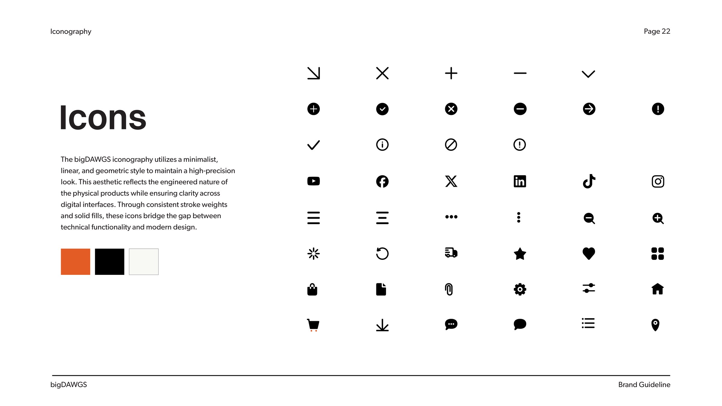
bigDAWGS brand book page 22: icon set
The icon set: linear and geometric, with consistent strokes
07. Outcome

From brand book to website

The new colour went into use. The team moved straight into the website redesign, the system’s first full application, before I left.

Back