

I led the redesign of the bigDAWGS website: sixteen screens across desktop and mobile, a token based design system underneath, and a prototype wired end to end. Status: approved by our CEO.
-
Strategy
Positioning, information architecture
-
Design
Design system, prototyping
-
Role
Head of Design, bigDAWGS
A website redesign, and the design system behind it
bigDAWGS prints brochures and cards with a video screen, a speaker or an NFC chip built into them. The old home page led with the technology instead of a reason to buy it.
Almost nobody arrived knowing what they wanted
The old site was built for someone who already knew what they wanted. Almost nobody arrives that way. So before touching a layout, I went back through past projects and inquiries to see who was really landing on the site and what they were asking us for.
The same three groups came up over and over. Marketing agencies, corporate departments, and other agencies. They were there to explore services, work out whether we were credible, and ask for more information. Not to buy a named product off a category grid.
“The majority of website visitors and inquiries come from marketing agencies, corporate departments, and other agencies. They usually visit to explore services, check credibility, or request more information.”
From my audience research board
So I gave them names
Marcus
Head of Account Based Marketing, financial services firm
Sends campaigns to senior executives who never see them. Assistants intercept the mail. Emails go unread.
What he needs from the siteProof that a physical object gets through, and numbers he can take to a committee.
Sarah
Creative Director, marketing and creative agency
Loses competitive pitches because her ideas are all on screens. She wants something she can put on the table.
What she needs from the siteFinished work she can point at, and a sample in her hands before she pitches it.
David
Owner, commercial print shop
Masters ink on paper. Has no way to do the electronics, and will not buy a million dollar machine to find out.
What he needs from the siteDielines, file setup specs, and confirmation that we ship blind under his name.
Then I asked them directly
No survey tool, no formal study. Clients came into the office to look at samples, so I asked them there and wrote down what they said.
Small sample, and the answers repeated. They lined up with what the inquiry history was already saying, so that is what the brief got built on.
The two I kept coming back to
- “What is one thing you wish bigDAWGS gave you that would make working with us easier?”
- “What is still annoying about working with us?”
Which gave me three problems to design against
-
Marcus is a head of account based marketing who needs to know a physical piece will actually reach a guarded executive, because his digital outreach is intercepted before it lands.
-
Sarah is an agency creative director who needs to hold a finished example before she pitches it, because she cannot win a competitive RFP with an idea that only exists on a screen.
-
David is a print shop owner who needs specs and blind shipping confirmed up front, because he is committing to a client job he cannot produce in house.
Three needs, three different reasons, and later on three different ways out of the site.
Three ways the home page undersold the company
Almost nobody arrives already knowing they want a video brochure. Print with a screen inside it is not a line most marketers budget for, so a first time visitor needs a reason before a product. The old page opened with a product list.
I found three failures, and only one of them was layout.
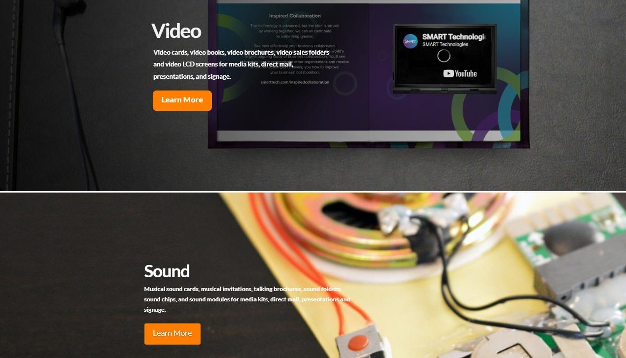
01
Four technology bands as the opening move. Video, Sound, NFC and LED, in the order the electronics work, not what any of it solves.
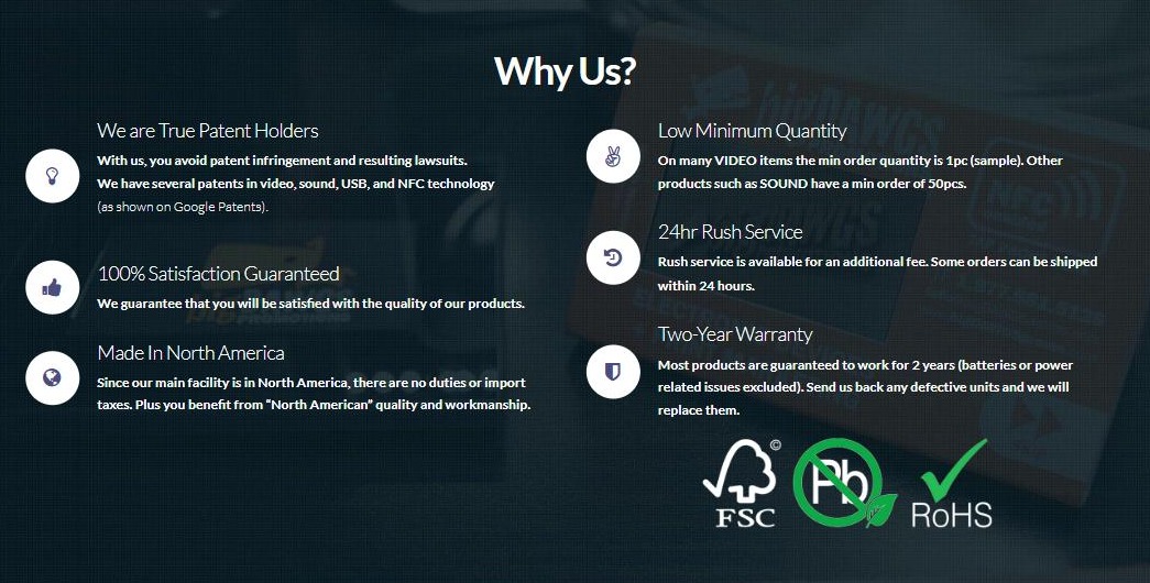
02
The patent appears once, as a trust badge. It sits beside a returns policy, so visitors skim past the one thing no competitor can copy.
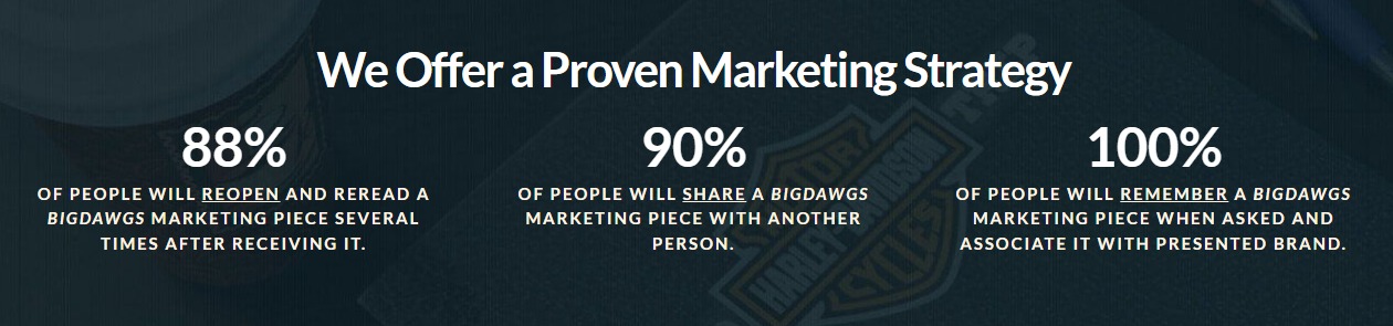
03
“We Offer a Proven Marketing Strategy.” Good numbers, written for us instead of for the person reading them.
A company of 16 people, so the scope was wide
bigDAWGS had 16 people, so one designer owned what a larger company splits across several roles. On this project that was the research, the site architecture, the design system, the UI and the prototype. Each round went to our CEO for sign off.
My part
Research, information architecture, design system, UI and the prototype
My team
4 people: 2 graphic designers, a content creator, and a social media and SEO specialist, plus 2 new Seneca interns every semester
On this project
A graphic designer, the content creator and interns, with rounds to our CEO
Outcome
Approved by our CEO
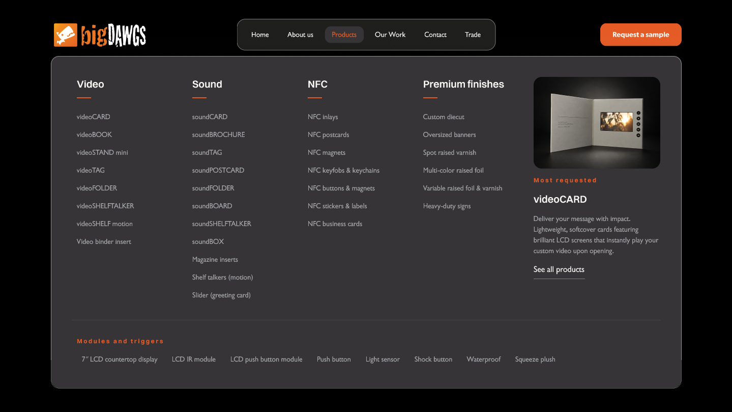
The first mega menu I built did not work. So I named six reasons why
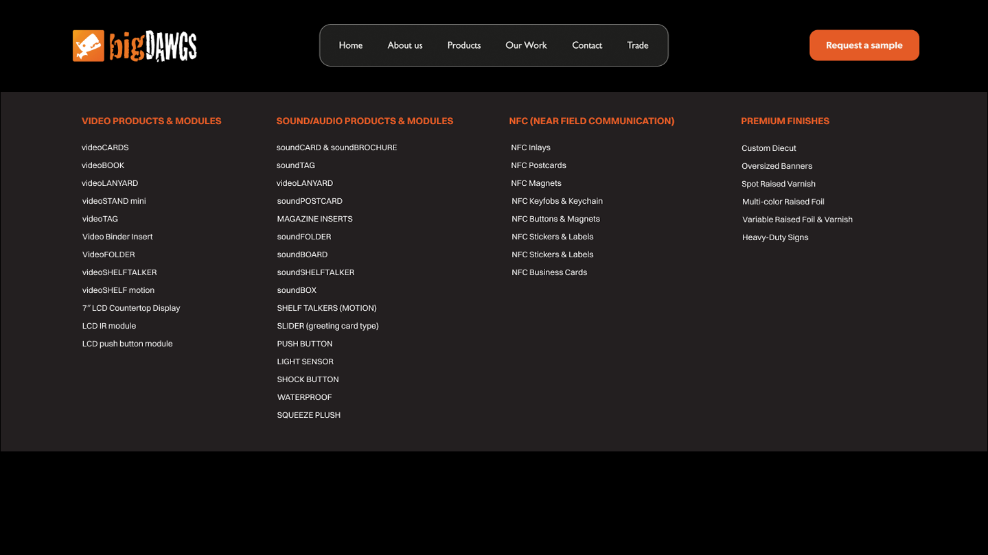
The old site had no mega menu at all, so I built one. The existing product list went straight in, unchanged, and the result did not work. Not badly enough to throw out. Just enough to keep bothering me.
Not landing is a taste note until you can name causes. So I made myself name them, and got six. Only one was cosmetic. The rest were decisions about what counts as a product and how anyone reads a list of them.
01
A full bleed panel opening under a floating pill, with nothing tying the two together. A visitor cannot tell the panel belongs to the button they just touched.
02
Nothing in the pill changed when the menu opened. No signal that anything was clicked, so the natural reaction is to click again and close it.
03
Columns running 12, 16, 8 and 6. The eye reads the long ones as the important ones, so NFC and Premium finishes look like afterthoughts.
04 · THE ONE THAT MATTERS
Two different kinds of thing in one list. videoCARD is a product. Light sensor and waterproof are trigger modules that fit onto almost anything. Nothing in the list tells a visitor which is which, and the old heading admitted it: “Video Products & Modules”.
05
Inconsistent casing inside one column: videoCARDS, MAGAZINE INSERTS, NFC Inlays, VideoFOLDER. People read different formatting as a signal that things are different. Here it signalled nothing.
06
No image anywhere, on a site whose whole pitch is physical objects that play video. Someone who has never held one leaves the menu still not knowing what it looks like.
The fix
Only the fourth one was a thinking error. The rest followed from it. Once products and modules share a list, the columns go uneven, the casing drifts, and there is no room left for a picture of the thing being sold.
Four product columns above a divider, trigger modules on their own strip below it. Casing follows the convention the brand already used. Sound drops from sixteen items to eleven, and the columns even out without being forced.
Everyone in this market sells it the same way
I audited seven companies, two different ways. Four direct competitors on positioning and site experience: Video Plus Print, Vidioh, Valsen Tech, TV in a Card. Then a capability pass against the companies a buyer would realistically shortlist us next to, including the print shops and the NFC suppliers who each do half the job.
All of them behave like catalogues. Screen size, memory, battery life, laid out in a grid. That answers a question nobody asks first. Not one of them explains what the object does to the person who receives it, and not one shows any evidence that it works.
“Competitors function as digital catalogues rather than strategic partners. They list tech specs rather than the outcome. None of them present the evidence.”
My audit takeaway
First pass. How the competition scored
My own rating, out of ten, four direct competitors. Pick an axis.
Second pass. Who else a buyer would call
Not competitors, alternatives. An NFC supplier and two commercial printers.
Read the last row. The NFC supplier has the chip and cannot make the enclosure. The premium printer has the foil and the die cut and cannot integrate the electronics. Going anywhere else means running two vendors and owning the risk where the two halves meet. That row is the business, and it was nowhere on the old site.
The pattern
Four sites, four catalogues. Every one of them leads with hardware. Screen size, memory, battery life, in a grid. A buyer who does not already know what a video brochure is learns nothing about why they would want one.
The opening
Nobody was claiming the strategist position. If everyone competes on specifications, the company that explains the outcome and can prove it is not in the same fight. That is the gap I designed toward.
What the home page needed to do instead
The new page makes its case in four steps. First, why the mail and email a company sends mostly gets thrown away. Then, why sending more of it does not help. Then, what a printed piece with a screen and a chip in it does that paper cannot. Only after all that, the products.
Two of those steps had nowhere to live on the old site. It never described the problem, and it never explained how the technology works. Those two are the whole difference between a catalogue and a case. Everything else on the page already existed in some form.
The product grid survived, but it moved down the page and changed its job. It used to list five technologies by how they work. Now it lists five product lines by what they do for the buyer, and only the ones the business actually sells.
Sorting by outcome also means the popular ones can go first. A grid sorted by technology cannot do that, because the order is decided by the hardware rather than by what anybody asks for.

Live today
Scroll inside the frame to read the whole page.

Redesign
Scroll inside the frame to read the whole page.
What the patent actually does
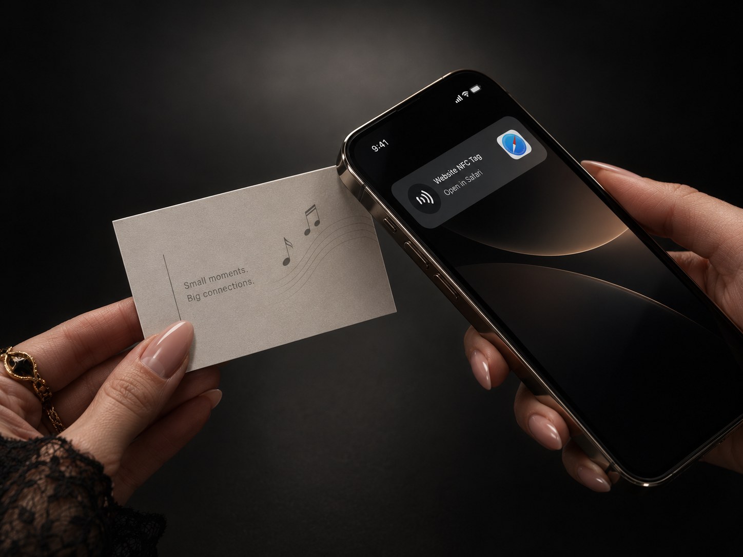
The patent is on the NFC chip. On the old site it sat in a Why Us list as one bullet, next to the satisfaction guarantee, and nothing anywhere said what it was for.
What it protects is the tap. In an ordinary NFC mailer the chip can be read the whole time the piece is in the post, so anyone who handles it can pull the link off it. Here the chip is shielded inside the piece and only wakes once someone physically opens it.
That is the answer to the objection every buyer raises about QR codes, which is that anyone can print a fake one, and in a regulated industry a link that might have been swapped does not get past compliance.
Checking the numbers before using them
A marketing site does not print footnotes, and it should not. Somebody has to know where the numbers came from, though, and on the old site nobody did.
So before writing any copy I built a fact bank: every claim the site might want to make, each one traced back to a published source. Forty seven in the end. These three carry the argument on the new home page.
82%
trust print most when deciding what to buy
No digital format cleared 50%. This is why the pitch is a physical object at all, and it opens the new home page.
MarketingSherpa 2016 · 1,200 US consumers70%
higher brand recall than a digital ad
75% named the brand unprompted after direct mail, against 44% after a digital ad. Physical takes 21% less effort to process.
Canada Post · True Impact, 201539%
cannot identify a malicious QR code
The case for a chip that stays shielded until the piece is opened, made by the thing it replaces.
Ivanti 2021 · 4,157 respondentsThe rule
The sources live in that document, not on the home page. Nobody buying print reads footnotes. The point was that when a client asks where 82% comes from, there is an answer.
A claim with no answer gets cut rather than reworded. The 100% the old page led with is not on the new one.
Structure first, pencil second, pixels last
The site map came out of the three routes, not out of a template. Each person hits the same fork, do they already know what product they need, and each one leaves by a different door. Marcus wants a conversation. Sarah wants something she can show a client. David wants specs and a sample, fast.
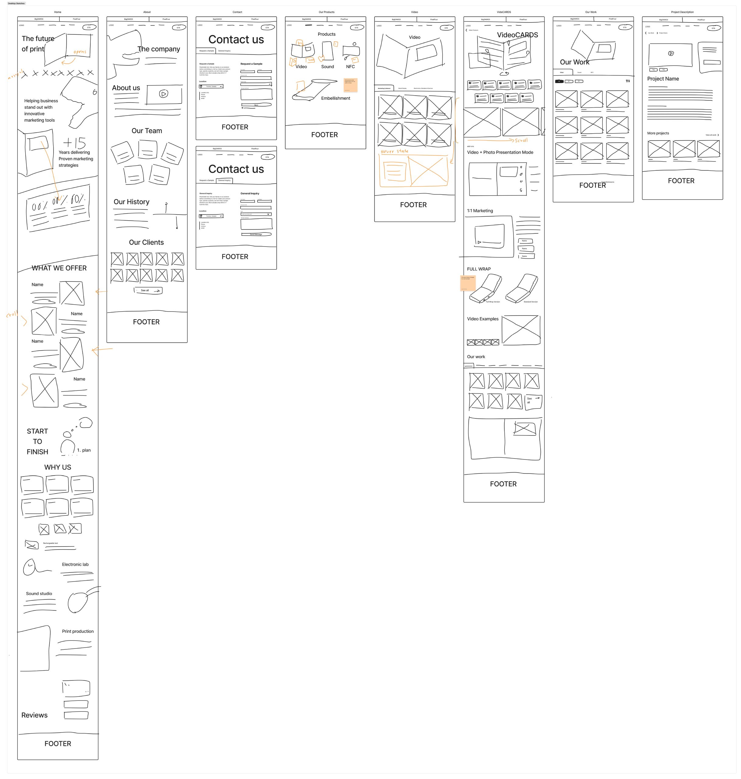
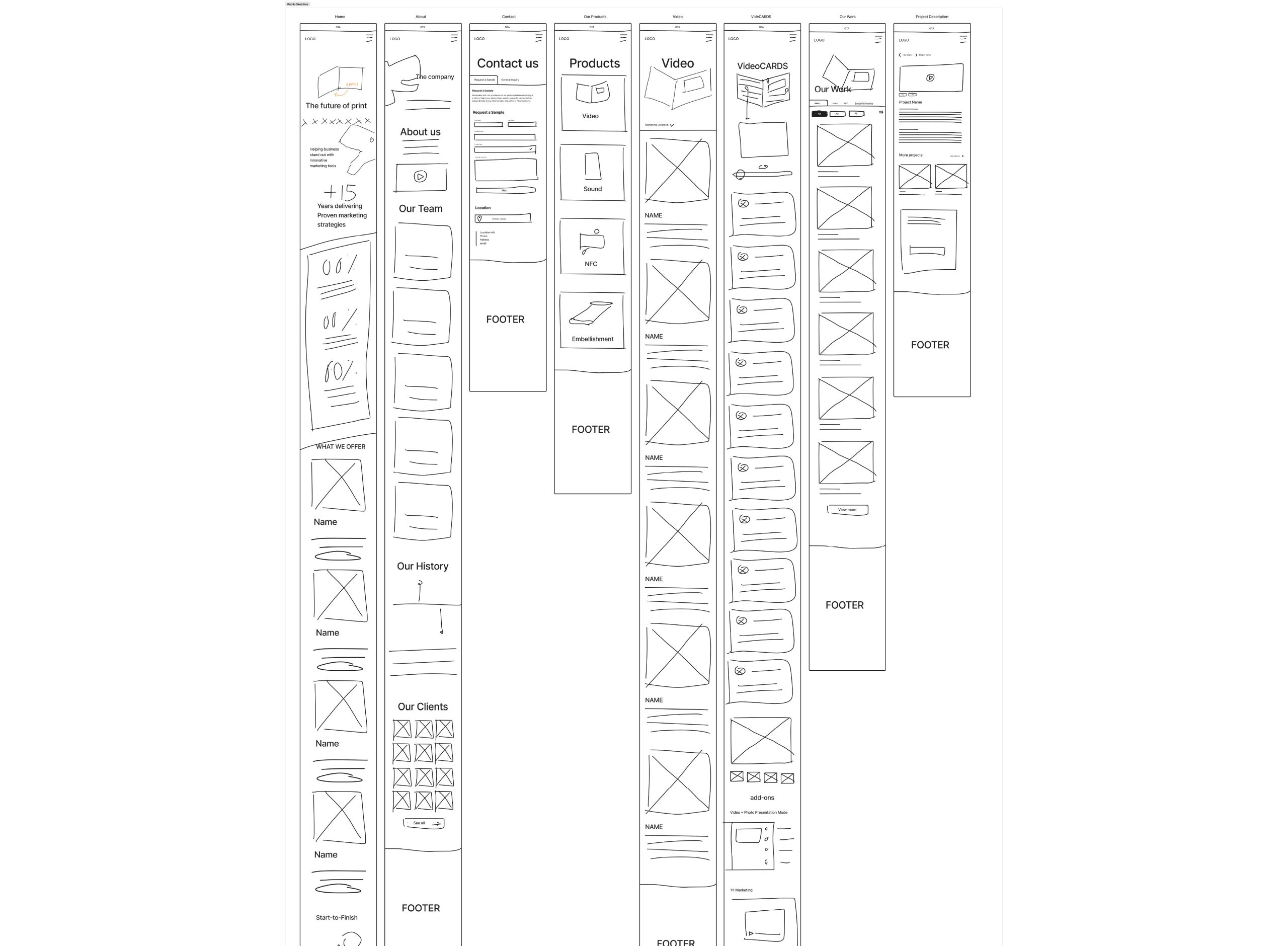
Getting that wrong is expensive later. So I drew the routes, then the structure, then sixteen screens in pencil, and only after that did anything get designed.
Three people, three routes, three exits
I mapped each one before deciding what pages existed.
The call that came out of it
Contact had to split in two. A general inquiry for people who want to talk, and a sample request flow for people who want the object in their hands. Two different intentions were sharing one form.
The sample flow asks for product type, quantity, contact and shipping across steps rather than in one wall of fields. A multi step form is easier to start, and asking for the email at the end rather than the beginning is what actually gets it finished.
Then, pencil
Eight desktop and eight mobile, with the scroll behaviour, the hover states and the card that opens on the hero all annotated in the margin.
Every clickable thing is one component
Every interactive element is a component with variants, so hover, press, focus and open are properties of one thing rather than four separate drawings. Smart Animate only moves between variants of the same set, so the prototype cannot behave without it.
It also means the button padding lives in one place. Get it wrong and you fix it once.
Where I changed the brand book’s rule
The book sets radius as a proportion of element size, roughly a quarter of the height. At the default button, 45px tall, that lands on 12 and everything is fine. At the large button, 60px tall, it lands closer to 16, and the same button in two places stops reading as the same component.
So radius is a fixed token now, 12 for controls and 16 for containers, and it does not scale. Nesting is governed by a rule anyone can apply instead: outer radius equals inner radius plus padding, with three worked examples on the Foundations board. The formula is followed at one size and deliberately broken at the other, and the reason is written down next to it.
Raw values and the rules that govern them. Nothing above this level invents a number.
Open this board in Figma ↗The smallest things a person can click. Each one a component set, so hover, press and focus are variants rather than separate drawings.
Open this board in Figma ↗Atoms assembled. The work card is one component with properties, so every place it appears on the site is the same object.
Open this board in Figma ↗Full page regions. Change a button here and it changes in all sixteen screens, because it is the same component.
Open this board in Figma ↗Specs are the real values from the file. Shown here at reduced size so the whole scale fits one column.
The brand book calls it an 8pt grid. It is really a 4pt grid, because 12 is in there and 12 is not a multiple of 8. Nothing to fix, worth knowing.
outer = inner + padding
Nested corners must stay concentric. When a rounded element sits inside a rounded container, the container’s radius equals the child’s radius plus the gap between them. Get this wrong and the corners either pinch or run slack, which is the single most common reason a card looks amateur at a glance.
Radius is a fixed token, 12 for controls and 16 for containers, and it does not scale with element size. That breaks the brand book’s proportional formula at the large button on purpose, so one button reads as one component at both sizes.
Try the design system yourself
This block is the real thing, not a screenshot. Change the brand colour and the token chain resolves, the components repaint, and the WCAG ratios recalculate live. Both numbers in the contrast decision below are yours to verify.
Live · not a screenshot
The system, running in your browser
Every component below reads from one variable, the same way the Figma file does. Change the brand colour and watch the chain resolve. The contrast panel is the decision I had to document rather than solve.
aliased by
ships as
Nothing references the primitive directly. That is the whole point: one value moves, everything downstream moves with it, and no one goes hunting for hex codes.
Hover, press and focus are variants of one component, not separate drawings. Fix the padding once and it is fixed in sixteen screens.
Off white #F8F8F5 on the brand colour
Black #000000 on the brand colour
WCAG AA wants 4.5:1 for body text and 3:1 for large text. White on the brand orange measures 3.39:1, so it fails as body text and passes as a headline. I built black on orange and a darker orange and took both to the CEO. Black made the dog logo look menacing, and the darker orange no longer looked like bigDAWGS. We kept white and limited it to logos, headlines and buttons, never paragraphs. #9E3F1B, which clears AA with white at any size, is the hover state.
Three decisions I had to defend
Three kinds of judgement: a commercial call, a credibility call, and a call made under a constraint I did not control.
A · Structure
Restyle it, or move it
What I chose
Not a reskin of the technology bands. I moved the products down and put a Problem section above them.
Why
Styling changes how a page feels. Only order changes what it argues.
B · Credibility
The stat I would not run
What I chose
Of three counters (88 percent reopen it, 90 percent share it, 100 percent remember it), only the first two came from our own data. I cut the third.
Why
A round 100 next to an 88 and a 90 makes all three look invented.
C · Constraint
The contrast call
What was wrong
White on the brand orange measures 3.39:1. That fails AA for body text (4.5:1).
What I chose
I built both fixes, black on orange (5.82:1) and a darker orange, and took the numbers to the CEO. Black made the dog logo look menacing, and the darker orange stopped reading as bigDAWGS. We kept white and set a rule: white on orange only for logos, headlines and buttons, never body text.
Why
Headlines pass AA’s 3:1 large text rule and logos are exempt. Button labels are the one exception left, and I documented it on the Foundations board.
One colour, defined once, used everywhere
Sixteen screens need a layer underneath them, or the prototype is a slideshow. I built the colour as two variable collections: _Primitives holds the raw values, and Semantic holds aliases with real web names, so a developer reads --interactive-primary instead of a hex code. Every clickable thing is one component built on top of them.
One value, three names
color/brand/orange #E45B26
aliased by
interactive/primary
in code
--interactive-primary
Move the primitive and every component downstream moves with it. Nothing references a hex code directly.
Surface
surface/base#000000surface/raised#231F20surface/elevated#363436surface/inverse#F8F8F5Text
text/primary#F8F8F5text/secondary#A5A7AAtext/error#FF5C5C · 5.39 AAtext/on-interactive#F8F8F5 · 3.39 on orangeBorder
border/default#A5A7AAborder/subtlewhite at 8%border/focus#E45B26Interactive
interactive/primary#E45B26 · fill only, never textinteractive/hover#9E3F1B · clears AA with whiteA developer reads the name, not the hex. Move the primitive underneath and every one of these moves with it. The flagged row is the contrast exception, documented rather than hidden.
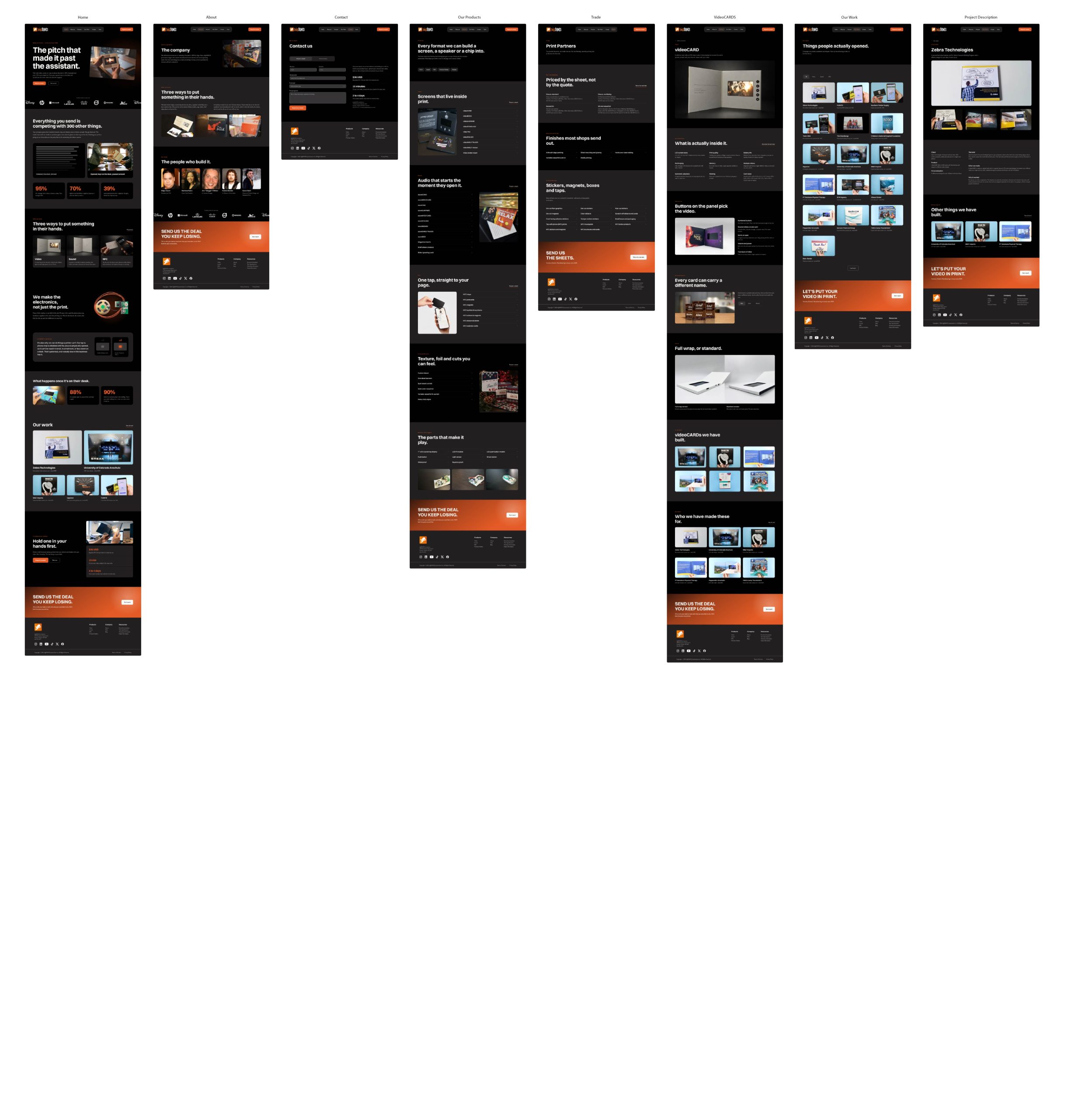
Sixteen screens, one system
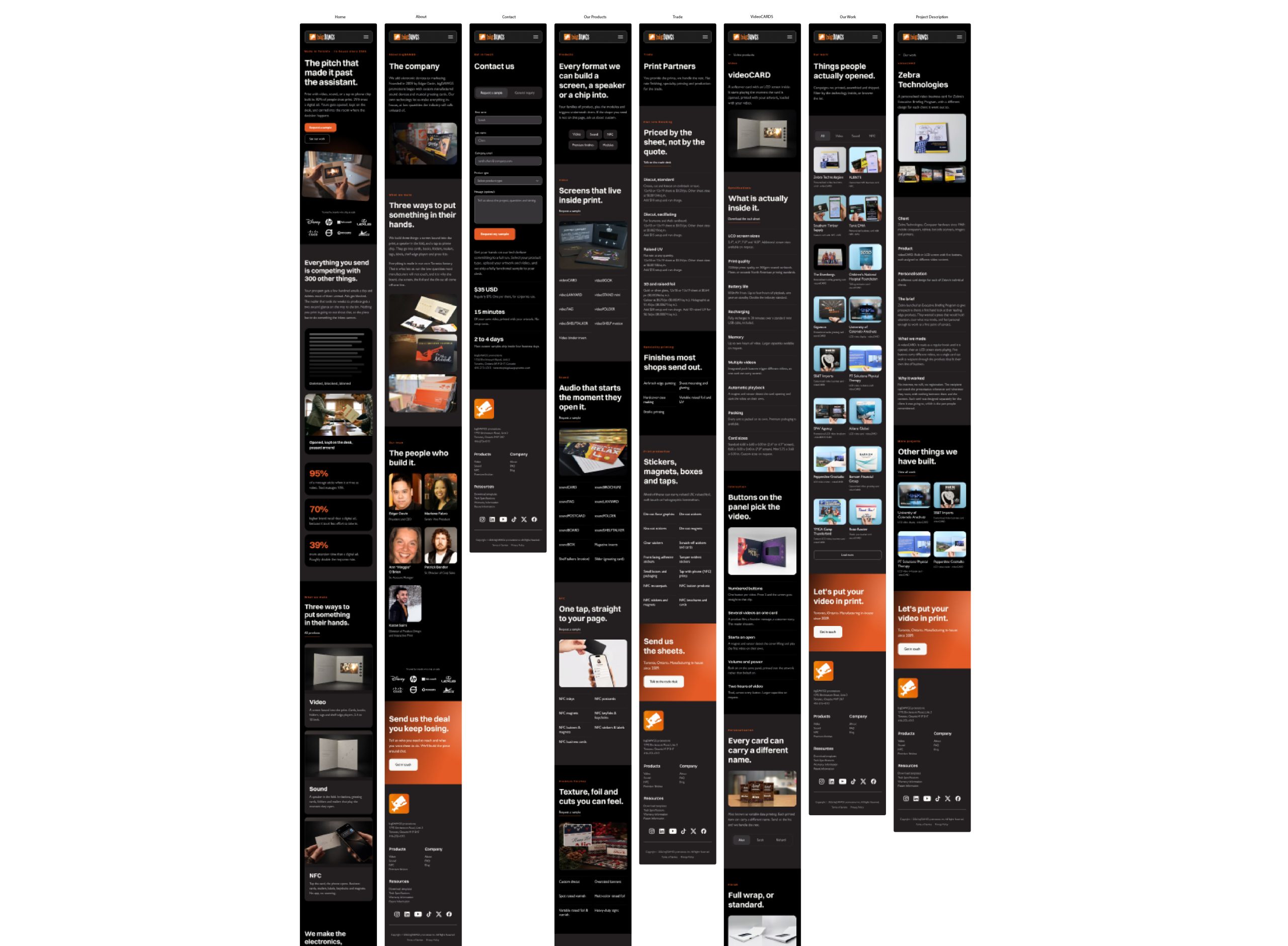
Eight desktop pages and eight mobile, all built on the same components. Mobile got its own press states instead of hover states, because a touch screen has no hover.
The prototype is wired, not drawn, and that is what got the work signed off. Instead of presenting flat screens, I presented a prototype that clicks through like the real site. A stakeholder imagining how something behaves and a stakeholder watching it behave are two different meetings.
Our CEO approved the redesign. I finished the design system and the wired prototype before I moved on from bigDAWGS.
Desktop · eight screens
Mobile · eight screens
What I would still change
Body text never sits on the orange, and that rule does the work. Button labels are the one place still under 4.5:1, and they’re the first thing I’d fix next.
Approved by our CEO. I finished the design system and the wired prototype before I moved on from bigDAWGS.