Three online stores

Task

Early at bigDAWGS I designed and built three WordPress and WooCommerce stores: a type foundry’s two old sites merged into one store, a greeting card shop reorganized around the people buying gifts, and a custom video card store built around a four step order flow. Canada Type still runs on the site today (credited in its launch post).

  • Strategy

    Research, user flows, information architecture

  • Design

    UX, UI, WordPress and WooCommerce build

  • Role

    Visual Designer, then UX/UI and Web Designer, bigDAWGS

Web and ecommerce · 2019 to 2020

Three online stores, designed and built

Before I led design at bigDAWGS, I built its stores. These three are where I learned to design something and then ship it myself.

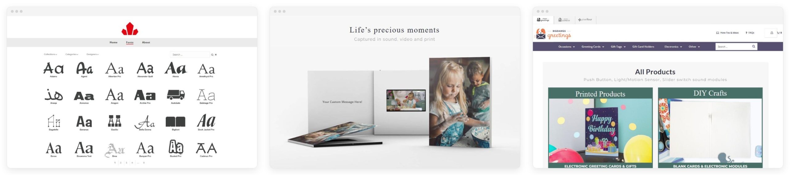
The three stores side by side: Canada Type, bigDAWGS Express and bigDAWGS Greetings
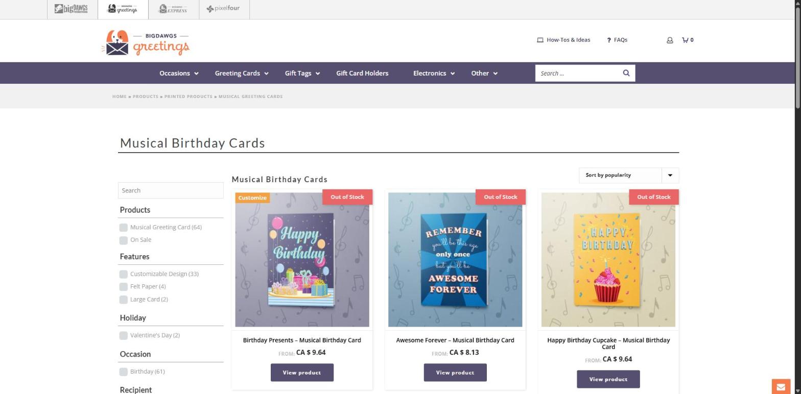
bigDAWGS Greetings: the musical birthday cards shop with filters and prices
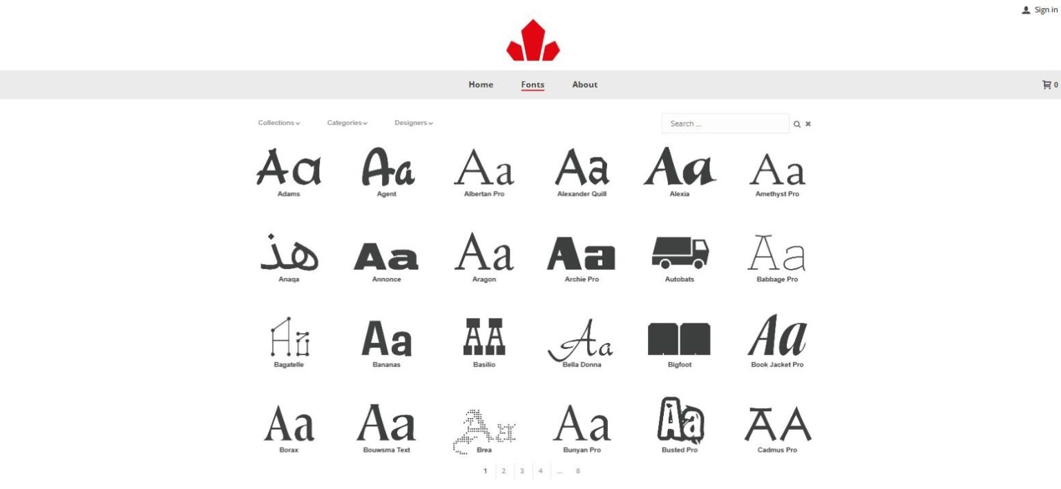
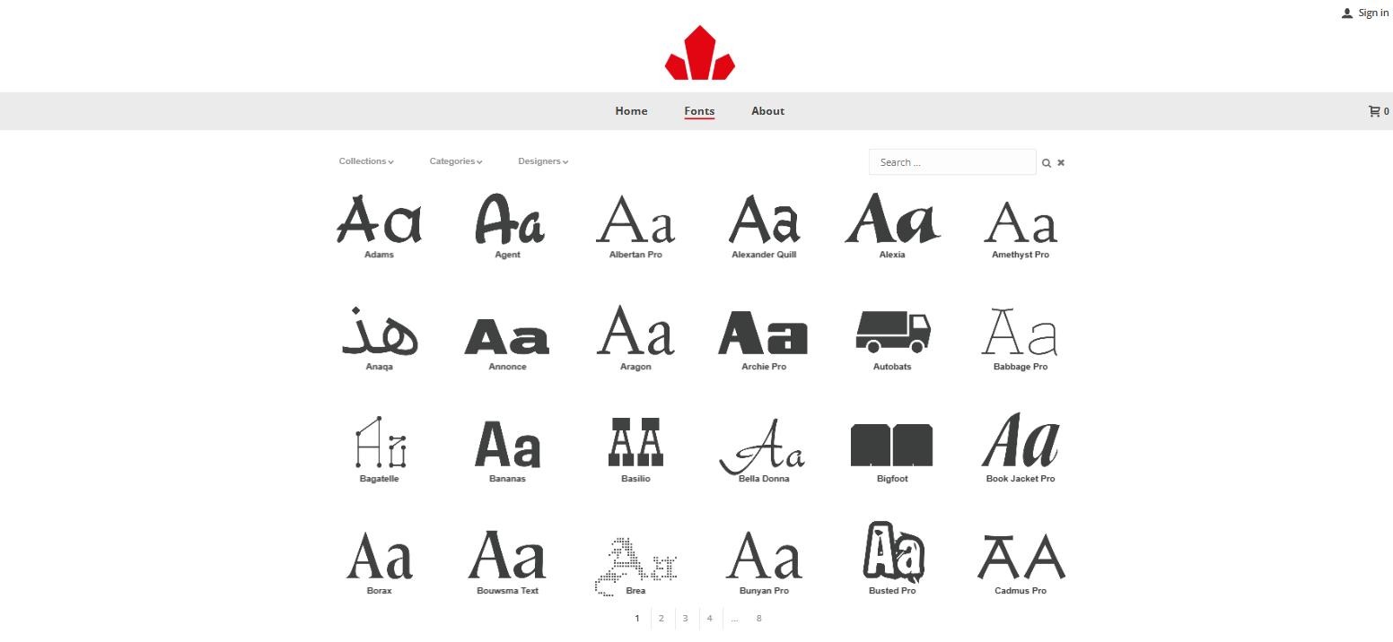
Canada Type: the fonts page today
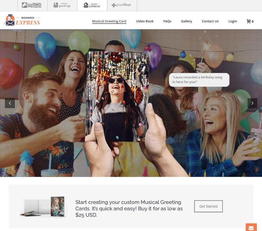
bigDAWGS Express: the musical greeting card page, a video card in hand at a party and the offer to start from 25 US dollars
01. At a glance

Three stores, three different problems

Each store had a different buyer and a different problem. Here they are side by side, then one at a time.

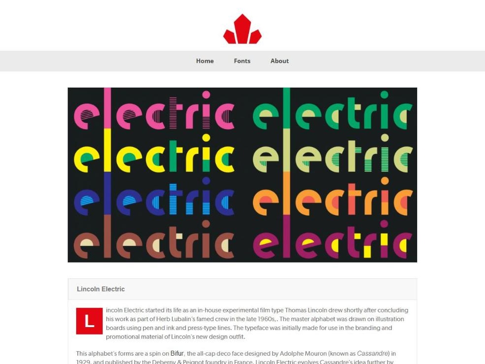
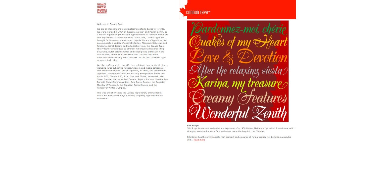
Canada Type’s Lincoln Electric font page today, with the slider of colour type samples and the font description
canadatype.com, a font page today

01 · CANADA TYPE

Two old sites, one new store. A PHP catalogue and a separate .net store became one responsive site, with a type tester on every font page.

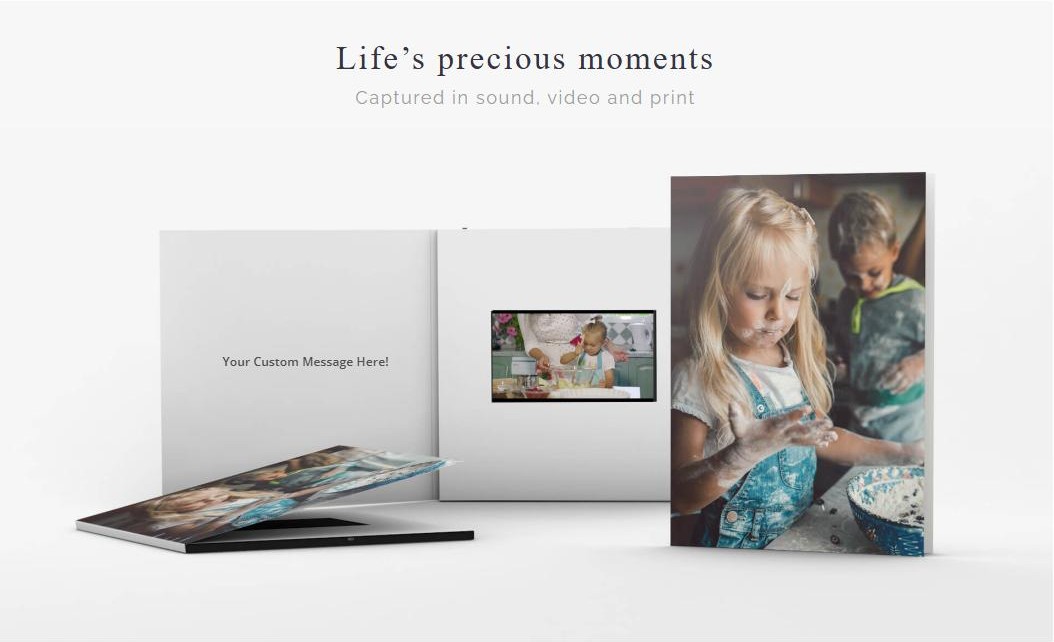
bigDAWGS Express product page for a custom video book
bigdawgsexpress.com today

02 · BIGDAWGS EXPRESS

A custom card with no easy way to order it. A brand new store that takes the customer’s own photo and videos in four steps.

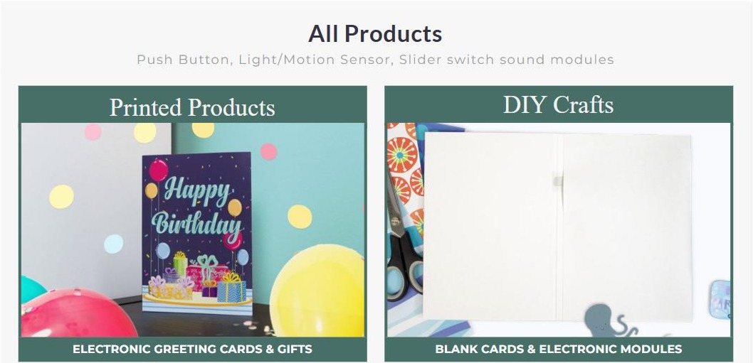
bigDAWGS Greetings home page with two ways in
bigdawgsgreetings.com today: the two paths

03 · BIGDAWGS GREETINGS

A parts catalogue selling gifts. Sound modules sorted by switch type. The new store is organized by occasion, and makers still find their blank cards and modules.

02. My role

The designer, and the one who built it

My computer applications degree is why the store builds came to me. The CEO and Creative Director approved each prototype before I built it.

Canada Type

My first year, as Visual Designer. The user flow, the font filter, how the type tester works on each font page, and the path from cart to payment. The brand and images came from Canada Type’s own designer.

bigDAWGS Express

Built next, still as Visual Designer, alongside my prepress work. The WordPress work on these stores is why I was promoted to UX/UI and Web Designer.

bigDAWGS Greetings

The biggest of the three, as UX/UI and Web Designer. Research, personas, prototypes in Adobe XD (which I brought into the company), then the build. A graphic designer colleague worked with me on the visuals.

Code

HTML, heavy custom CSS and PHP template edits in WordPress and WooCommerce.

Status

Canada Type still sells on the site. The two bigDAWGS stores wound down after the US tariffs; both sites still load.

03. Canada Type

Two old sites, replaced by one

Canada Type ran on two desktop only sites: an old PHP catalogue on .com and a separate store on .net that sold very little. I replaced both with one responsive WordPress and WooCommerce site: a sortable catalogue, search, a type tester, and customer accounts with order history. I finished it in my first year; it launched in 2019 after the client’s own testing, and its launch post credits the build to Ed Davin, Victor Lee and me.

A · Try before you buy

A type tester on every font page

What I chose

Visitors type their own words and change size, spacing and line height on the font page itself. I decided how it works, then set it up from a plugin and styled it for the catalogue.

Why

People buy a font for how it sets their words, not for a specimen image.

B · Browsing

A filter you can actually browse

What I chose

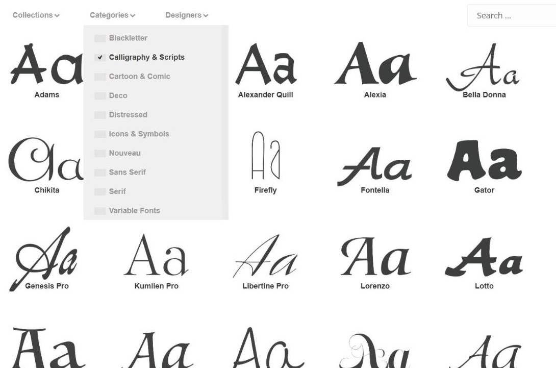
The client wanted an animated font filter with easing. I researched plugins that could do it quickly, then designed the filter in custom HTML and CSS.

Why

A big catalogue is only useful if you can narrow it fast.

C · Checkout

One site from browsing to buying

What I chose

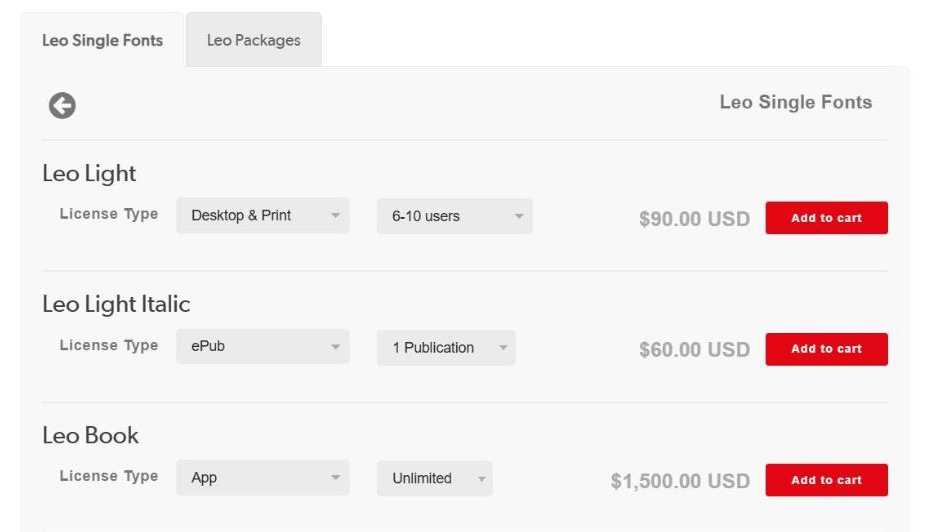
Licences (Desktop, Web, ePub and App) are bought on the same site people browse. I designed the path from cart to payment and the account area with order history.

Why

Buyers no longer had to jump from the catalogue on .com to a separate store on .net.

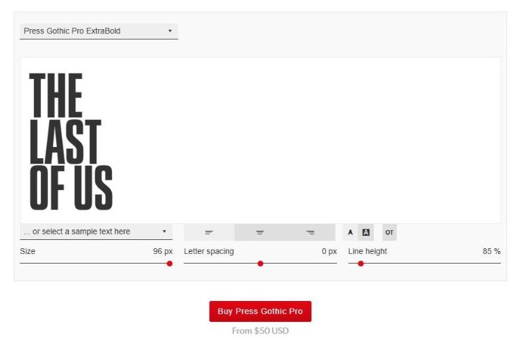
Canada Type type tester set in Press Gothic Pro ExtraBold, reading THE LAST OF US, with its size, spacing and line height controls and the Buy button
A · The type tester, live today
Canada Type catalogue with the filter open on Calligraphy and Scripts
B · The font filter in use
Canada Type licence picker for Leo: Desktop and Print for 6 to 10 users at 90 US dollars, ePub for one publication at 60, App unlimited at 1,500, each with Add to cart
C · Licences priced by style and use
Canada Type · before and after

2017, and today

Left, the old home page in 2017, from the Wayback Machine. Right, the font shop today, still running on the build I made.

SLIDE TO COMPARE

Before After
04. bigDAWGS Express

A brand new store, ordered in four steps

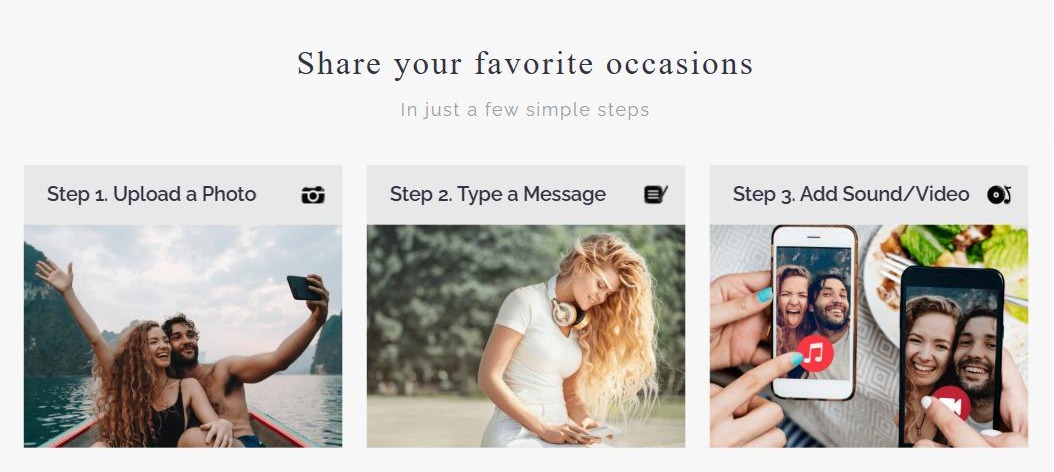
Express was a brand new store, so there is no before. I built it right after Canada Type, and it launched in 2019. It sold cards with the customer’s own video, song or photo inside, and the job was to make ordering one quick and obvious, closer to an app than a print order form.

The order flow on each product page

1Upload a photo, then crop and rotate it in the browser.

2Upload up to five videos.

3Write the message inside the card.

4Preview the video, then ship it to yourself or straight to the recipient.

bigDAWGS Express order flow on a product page
The home page sums up the order in three steps
05. bigDAWGS Greetings

A parts catalogue turned into a gift shop

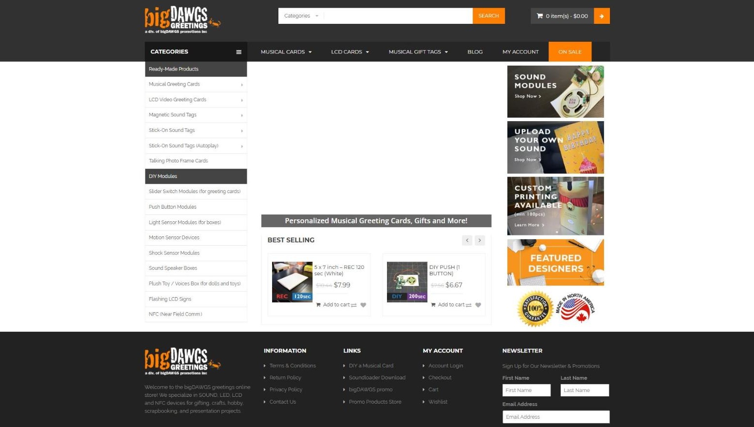
Greetings came after Express, as the bigger and more complicated build, and launched in 2020. In 2018 the store was titled “Sound modules and devices”, with a sidebar of parts like “Slider Switch Modules” and best sellers like “DIY PUSH (1 BUTTON)”. Two very different customers shopped there: people buying a musical card as a gift, and small businesses buying blank cards and modules. The target was something closer to Hallmark online.

A · Research

Who actually buys

What I chose

I pulled customer data from our Etsy and Amazon shops, used Google Ads and Analytics for age and visitor profile, and built personas from it.

Why

The store sold gifts for birthdays, holidays and anniversaries, but it was organized around parts.

B · Structure

Shop by occasion, in two paths

What I chose

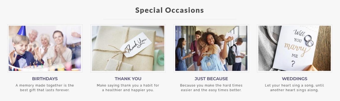
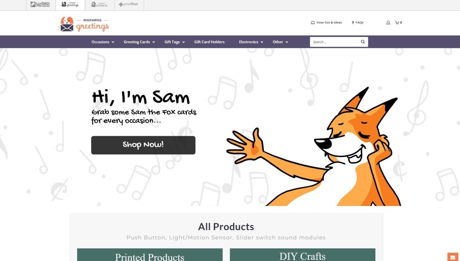
A menu by occasion and holiday, and a home page split into two paths: cards and gifts, or blank cards and modules.

Why

Gift buyers think in occasions. Makers think in parts. One menu couldn’t serve both.

C · Product page

Personalize, priced as you pick

What I chose

A “Personalize Your Card” block with sound options priced inline, a gift card pocket and quantity discounts.

Why

When the price updates as you choose, there is no surprise at checkout.

bigDAWGS Greetings cards sorted by occasion
B · Shopping by occasion, today
bigDAWGS Greetings · before and after

2018, and today

Left, the parts catalogue in 2018, from the Wayback Machine. Right, the home page today, led by Sam the Fox.

SLIDE TO COMPARE

Before After
06. What it changed

Why these are here

These builds are how I went from Visual Designer to UX/UI and Web Designer.

Back